


INTRO
Project Overview
Should you stay for the credits?
I conceptualized CreditCookies to be a fast, reliable way to know if a credit scene is worth waiting for without accidentally getting spoiled in the process.
Research & Discovery
Talking to a broad range of moviegoers to understand the real pain behind the search behavior.
Ideation & Prototyping
Exploring different directions and hitting dead ends. Also had a few assumptions completely flipped through testing.
Core & Scale
Validating the movie use case first, then expanding the scope only once the foundation was solid enough to expand.
The concept was made after one too many trips to the movies that ended in frustration because either I left too early, waited through endless credits for nothing or Googled it and got spoiled before I even stood up.
PROBLEM
Moviegoers Can't Find the Answer Safely
In 2022, I shared a survey across Reddit subreddits and Slack channels for moviegoers to understand the biggest issues with checking whether a credit scene was worth staying for without getting spoiled.
Every path to the answer risks exposing more than you wanted to know.
The existing tools aren't broken… Google, Reddit, and forums all contain the answer somewhere. The problem is that they deliver too much information when people only need one thing in that moment: a quick signal on whether staying through the credits is actually worth it.
Anyone can search their movie title with "no spoilers" attached.
But how convenient is that?
There is no purpose-built tool that delivers a crowd-sourced verdict on whether a credit scene is worth staying for, without revealing the scene itself, in under five seconds.
MOVE TO VIEW PROBLEMS
•
USER RESEARCH
/
PAIN POINTS
APPROACH
Building to Separate Decisions from Details
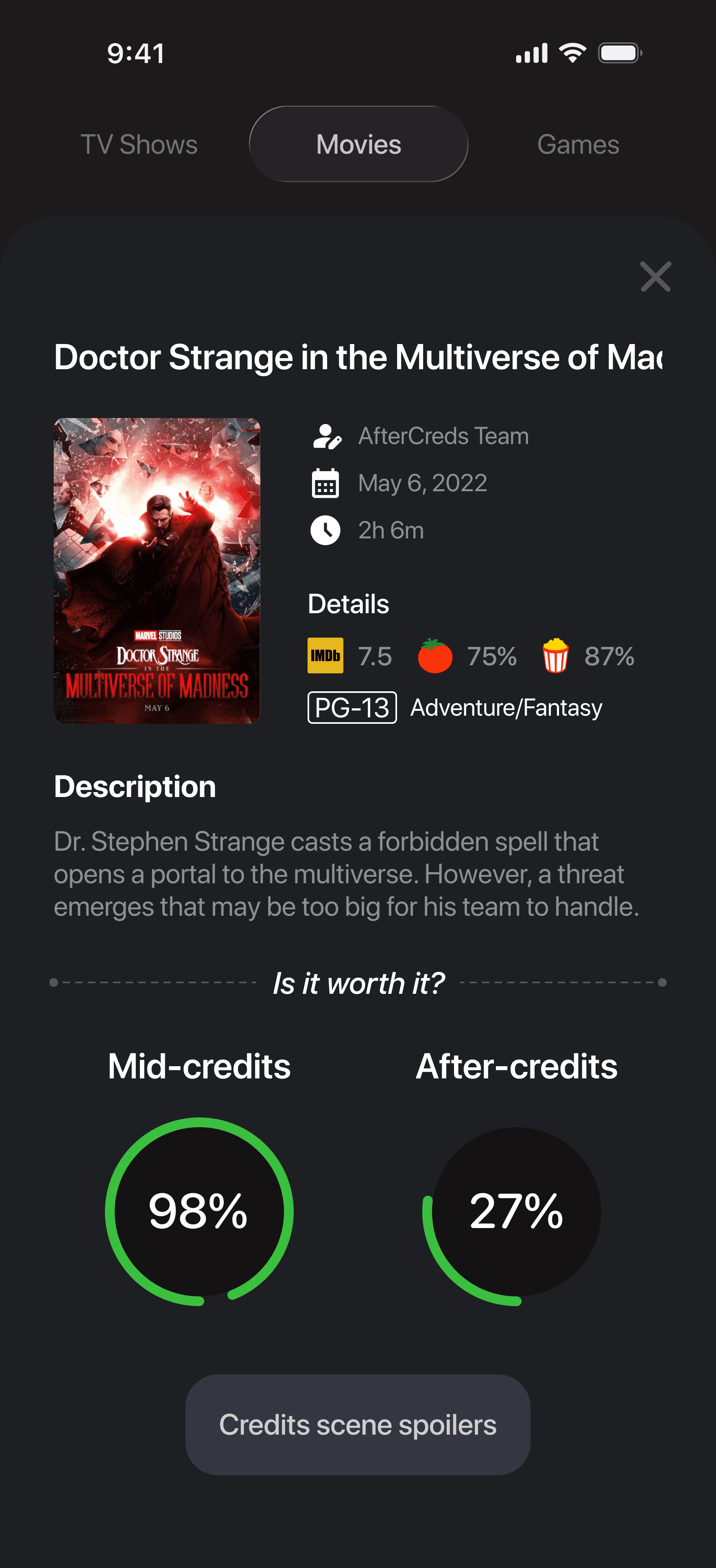
Instead of surfacing the full scene description, the product focuses on a simple, community-driven verdict first, while giving users control over whether they want to reveal anything further.
That leads to three design principles I want to focus:
Clear Signal
A clear, crowd-sourced verdict on whether the scene is worth staying for.
Full Control
Spoilers remain hidden unless the user intentionally reveals them.
Quick & Simple
Creating a smooth A to B experience that delivers the answer in seconds.
Voting for a Movie
An account is required to vote for a movie, however users can view if a movie is worth staying as a guest.
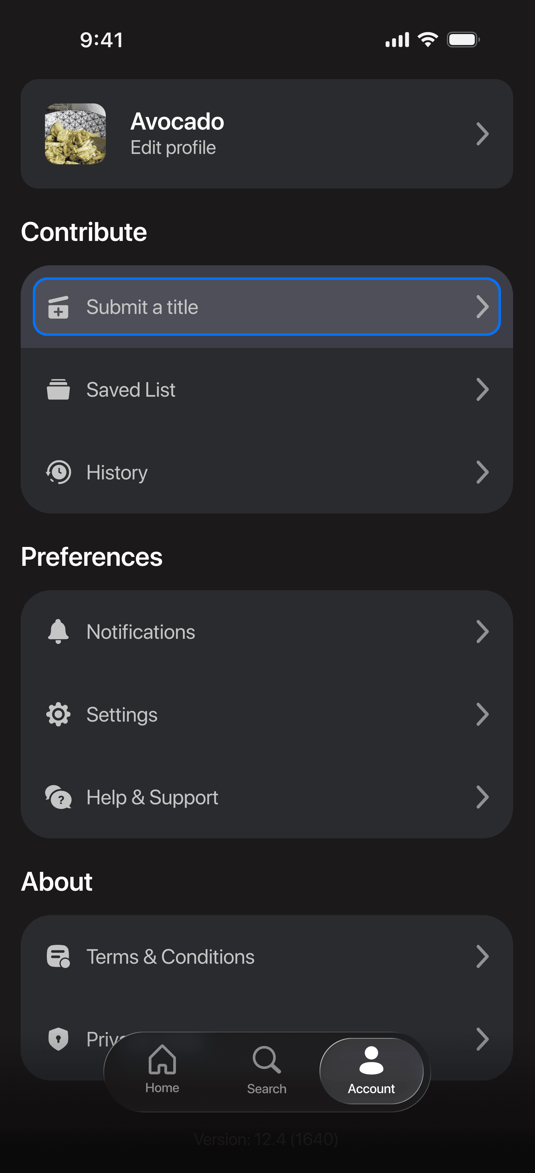
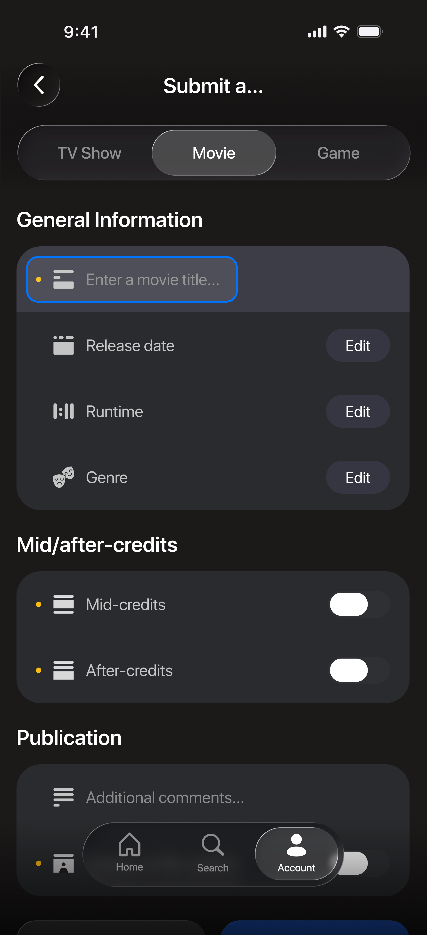
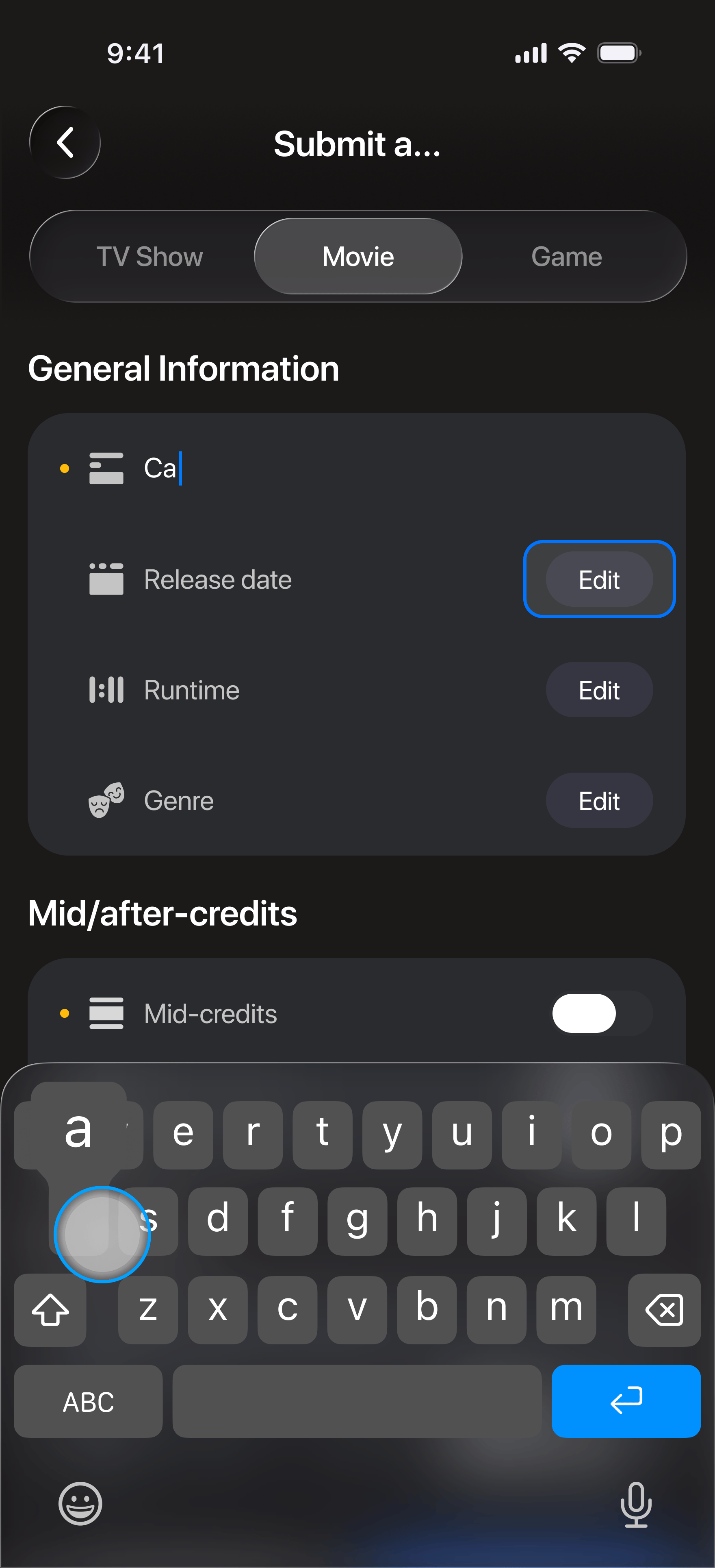
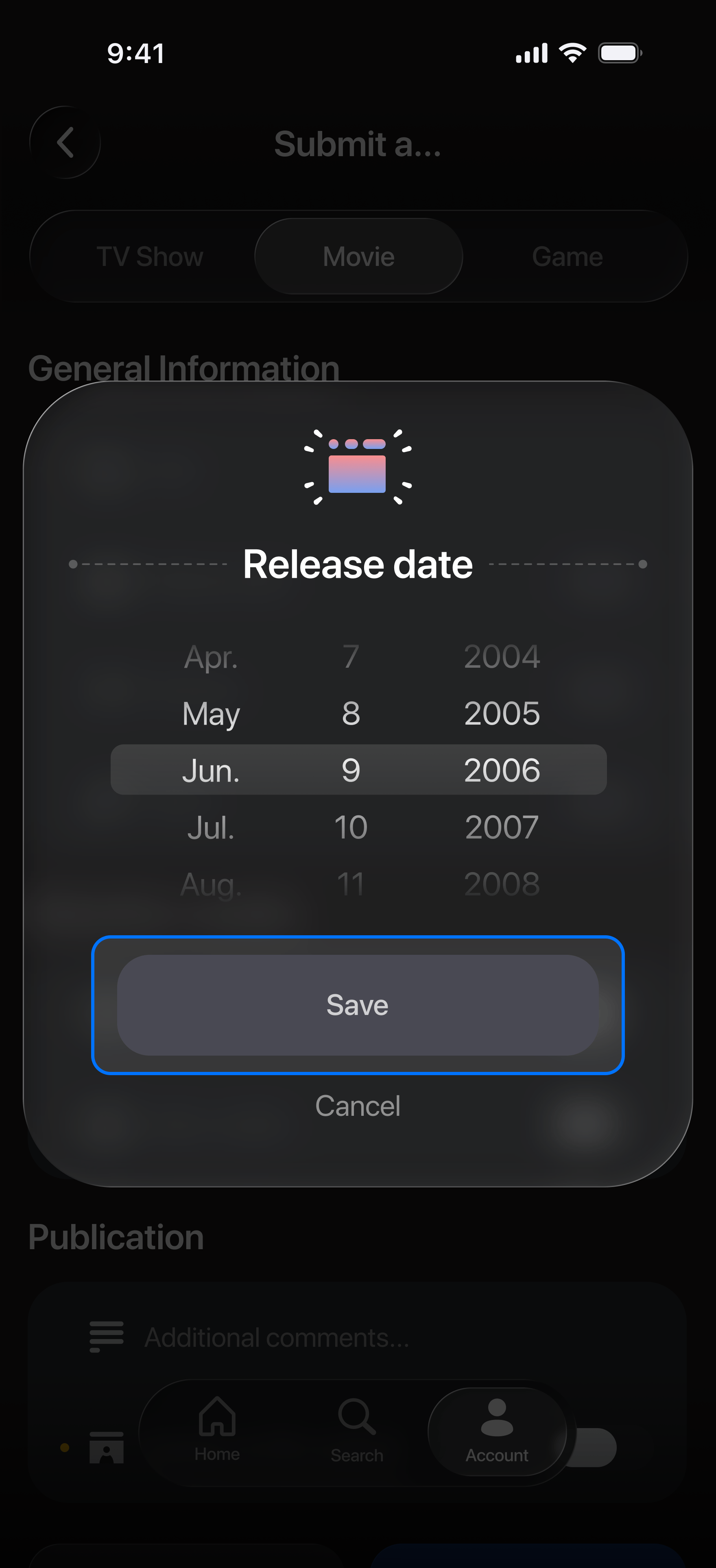
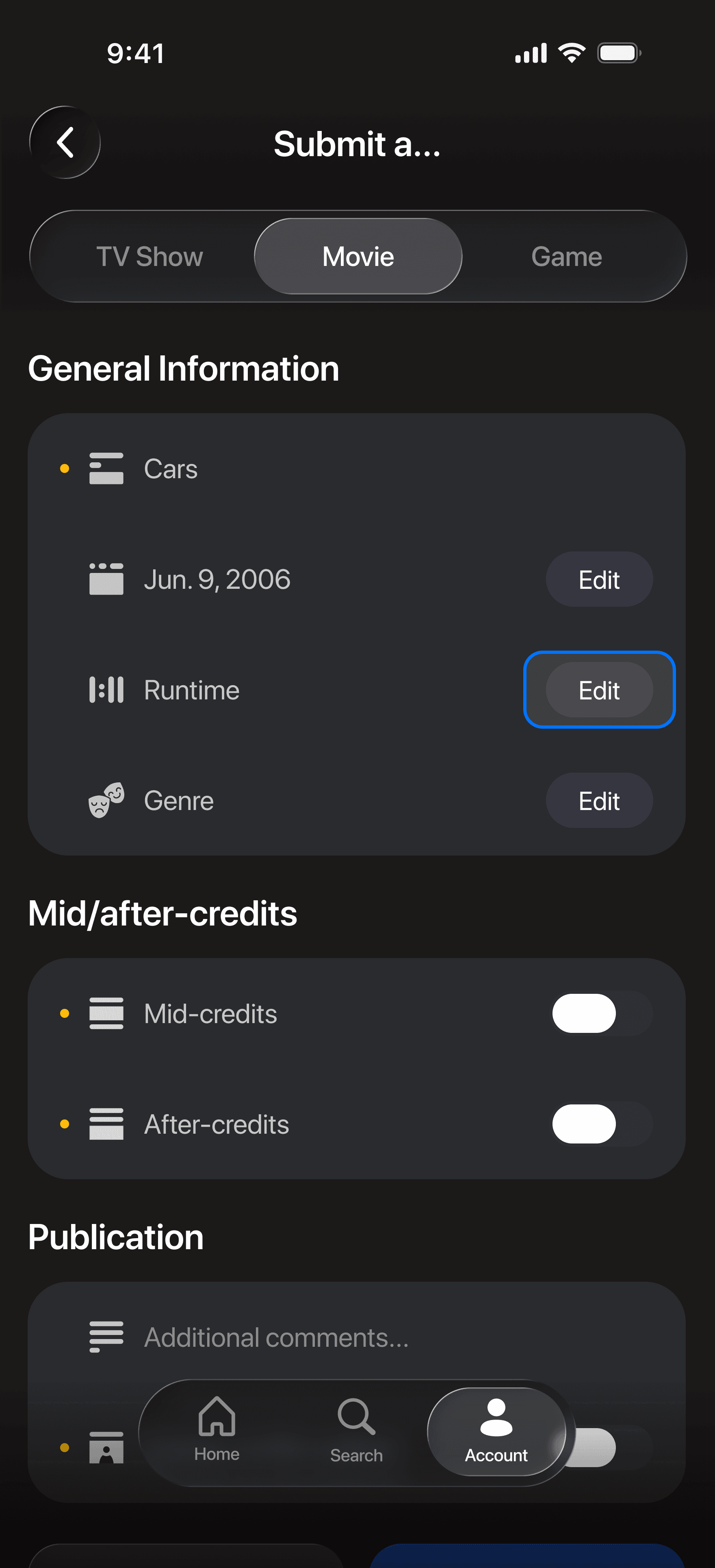
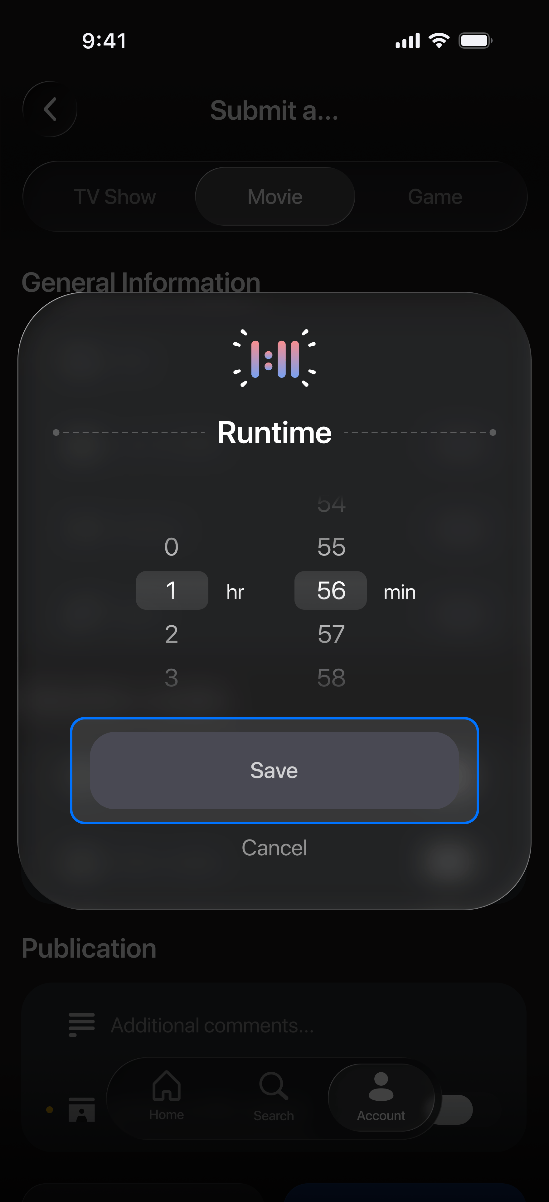
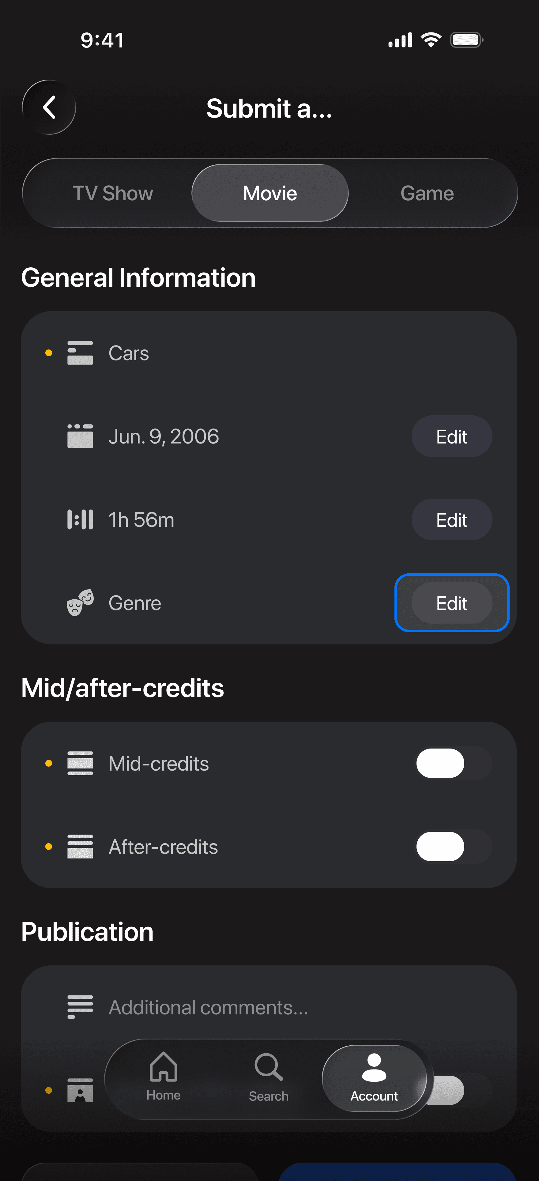
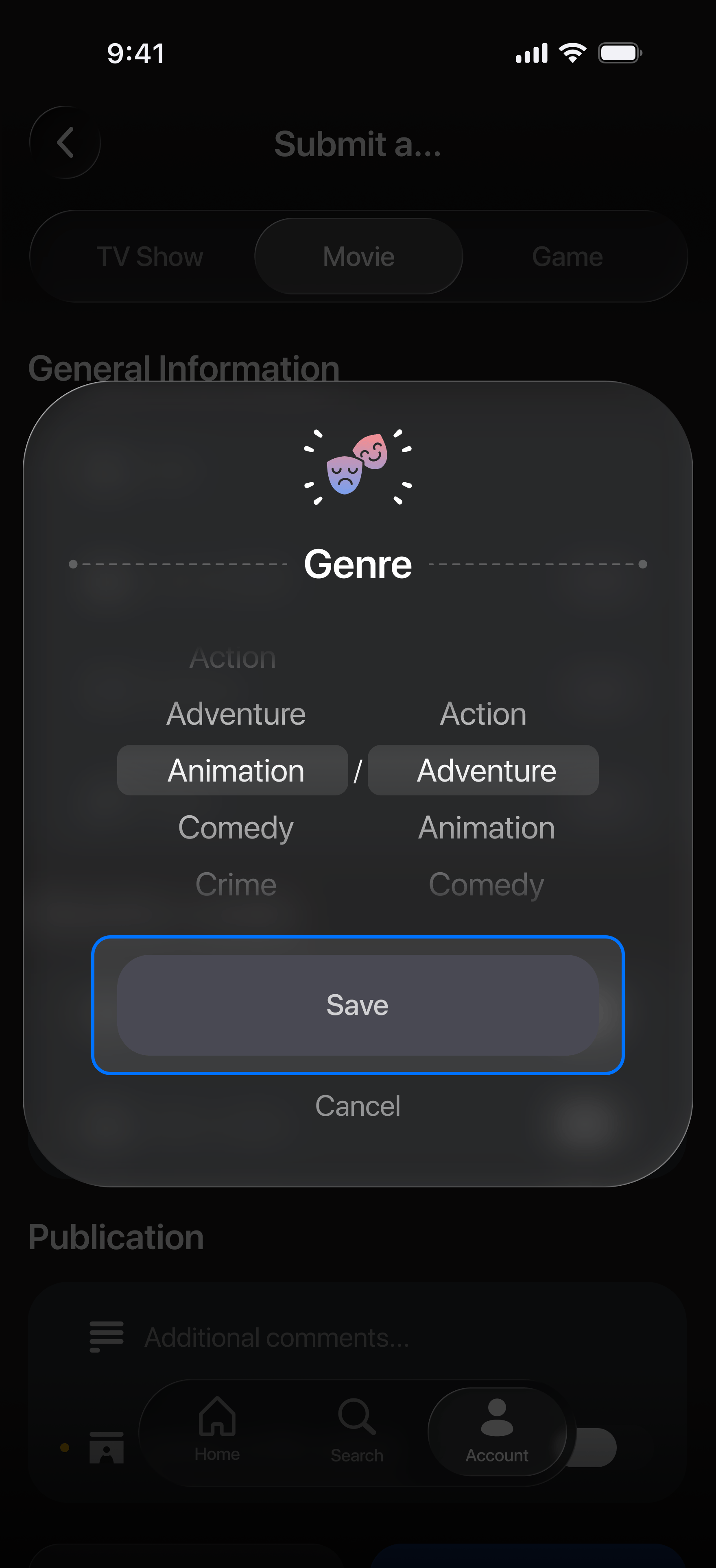

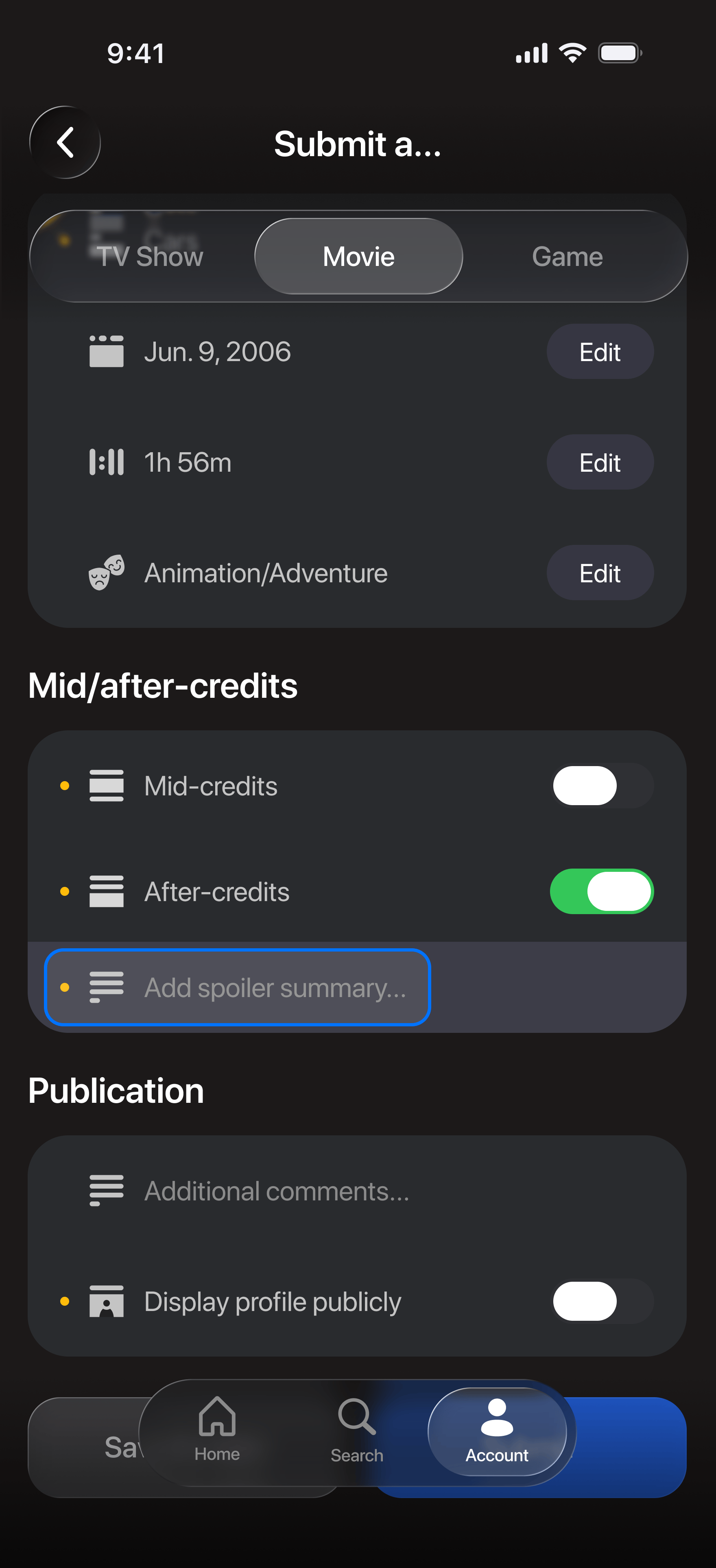
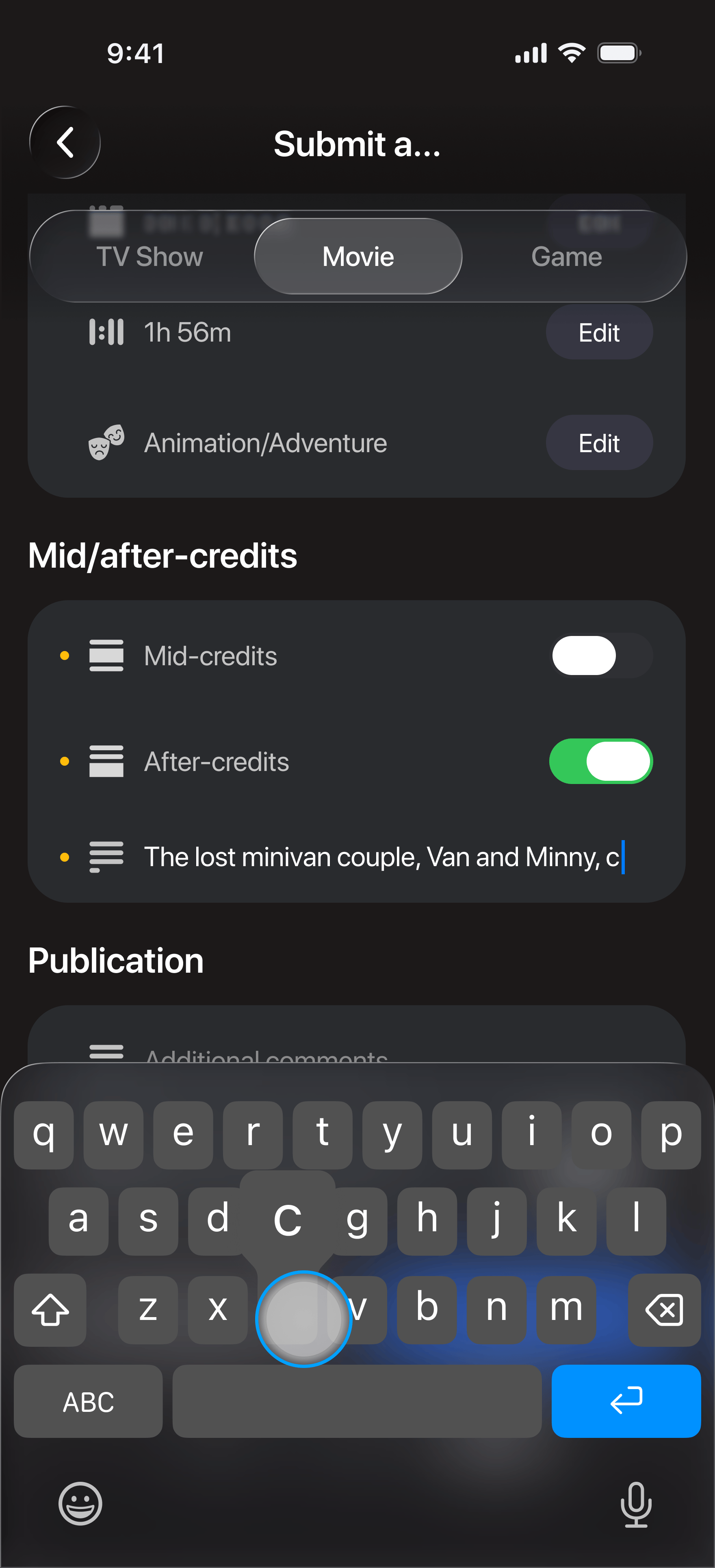

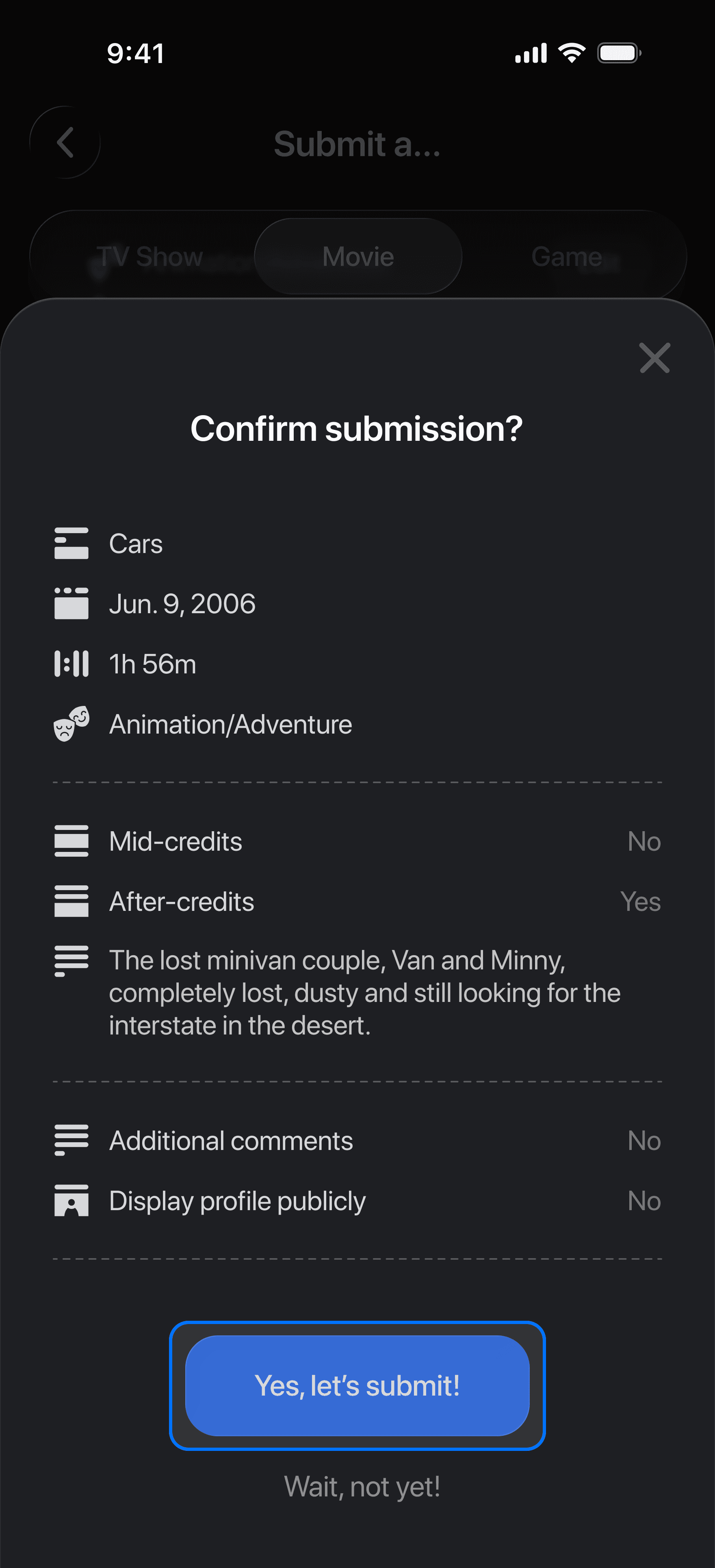
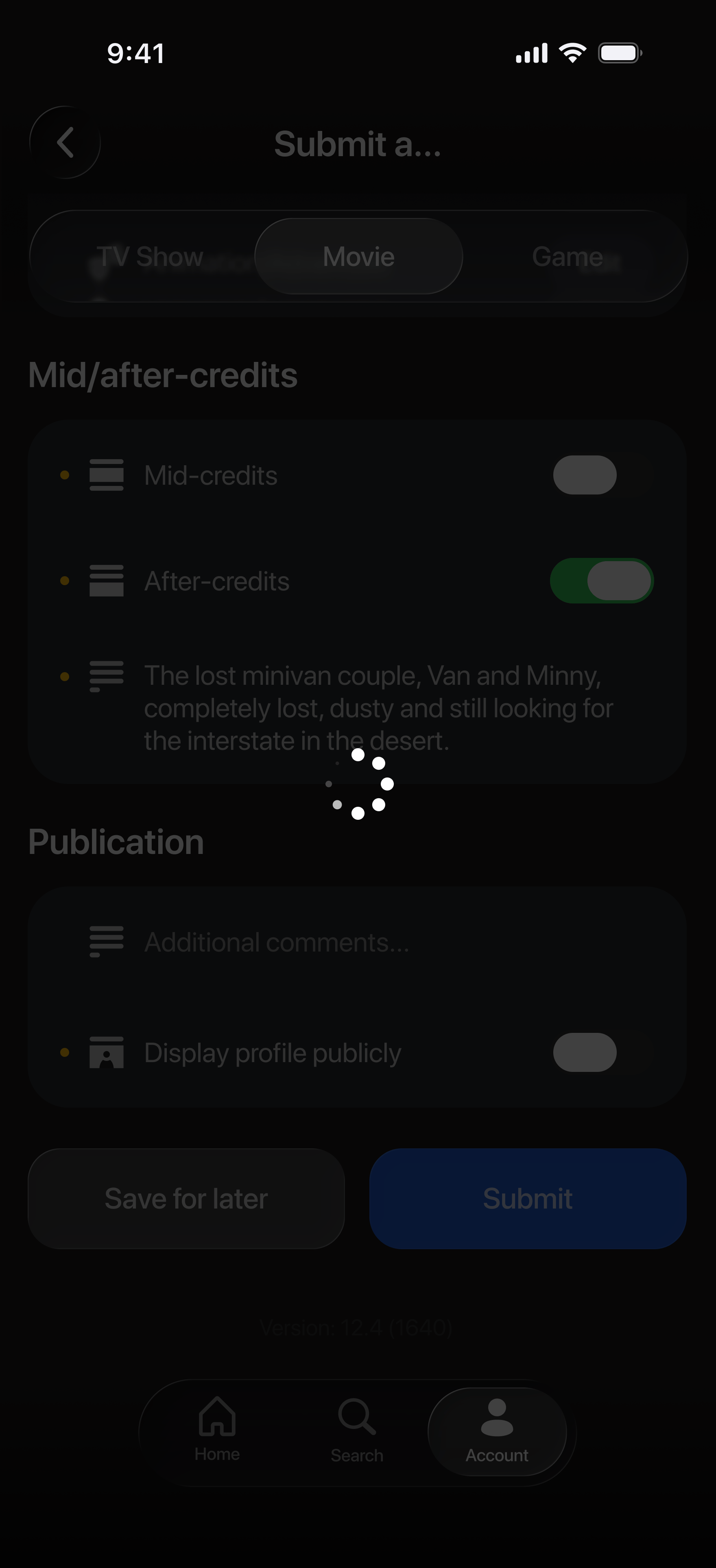
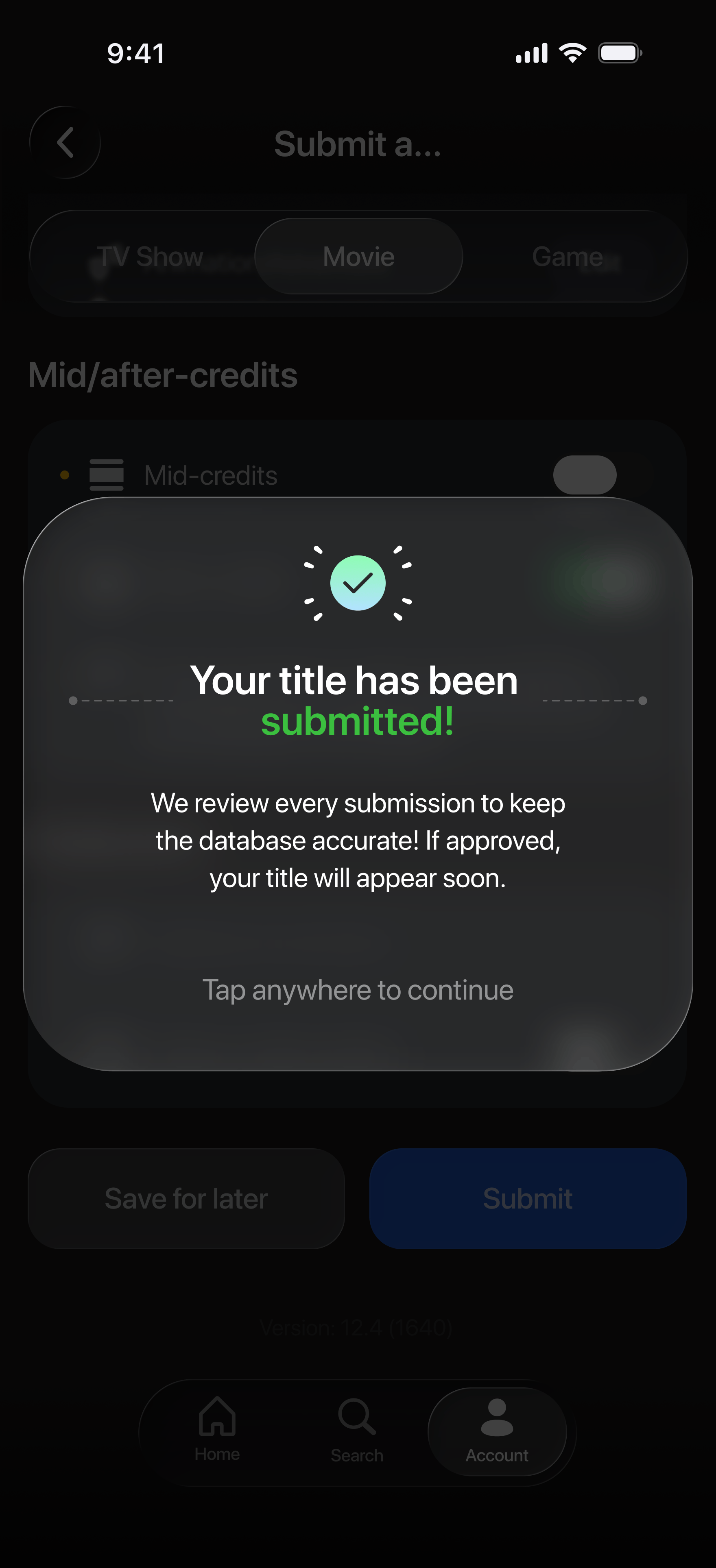
Request a Missing Title
Allows users to submit new titles directly into the review pipeline.
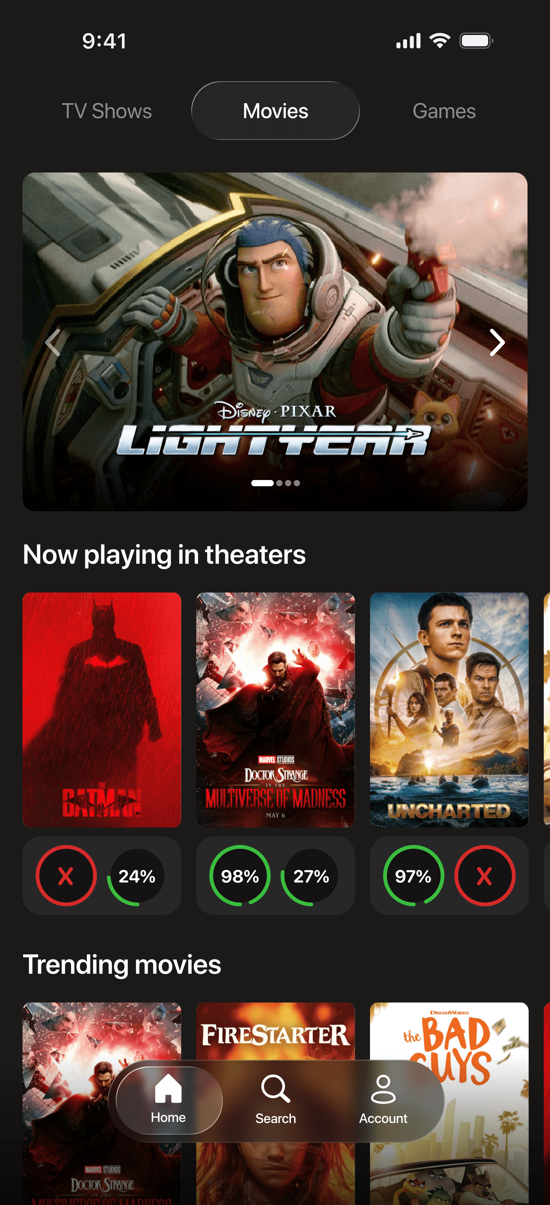
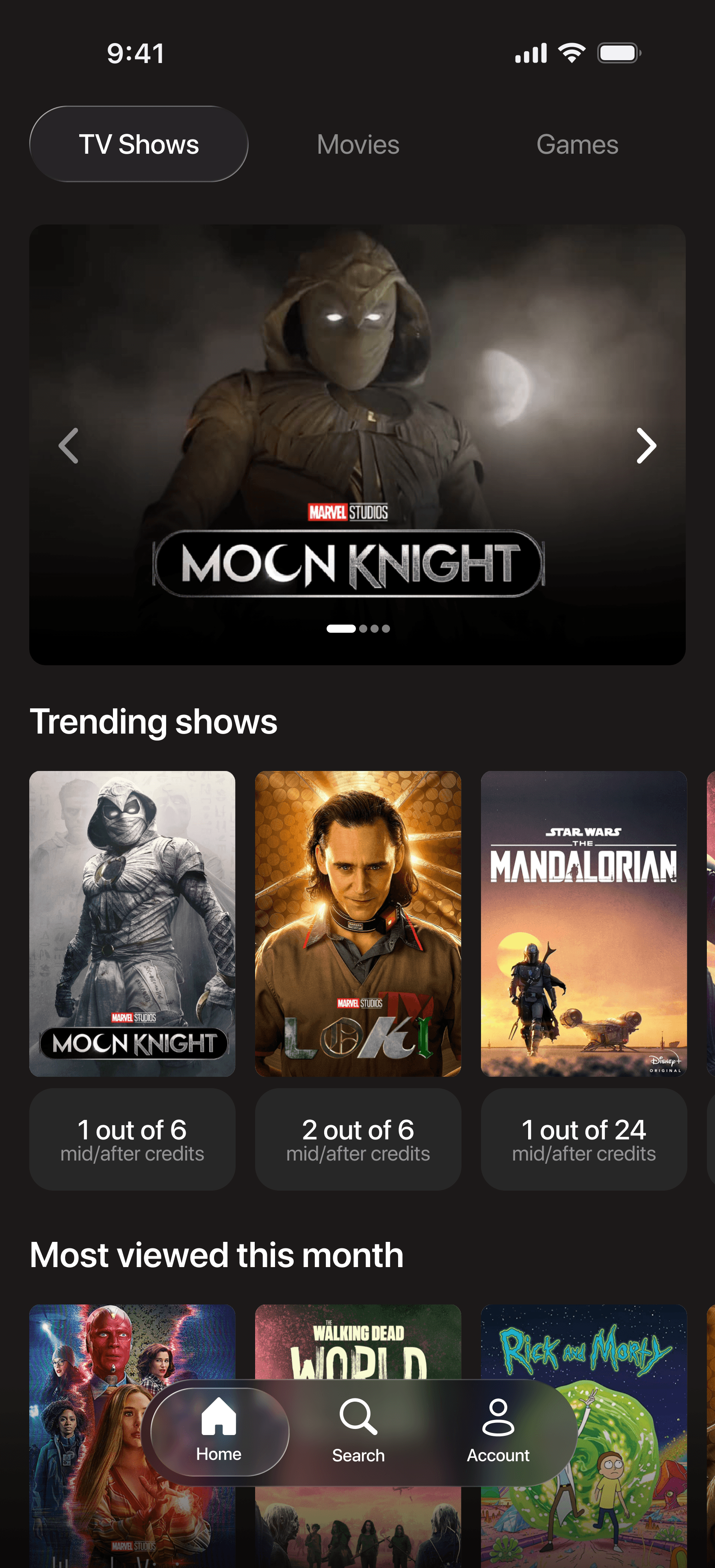
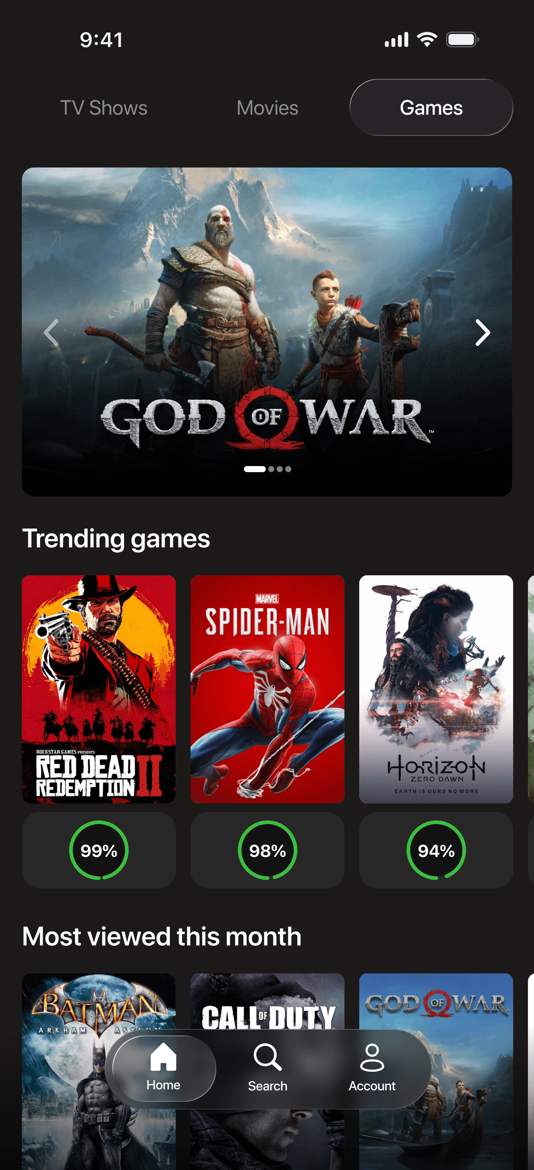
SOLUTION
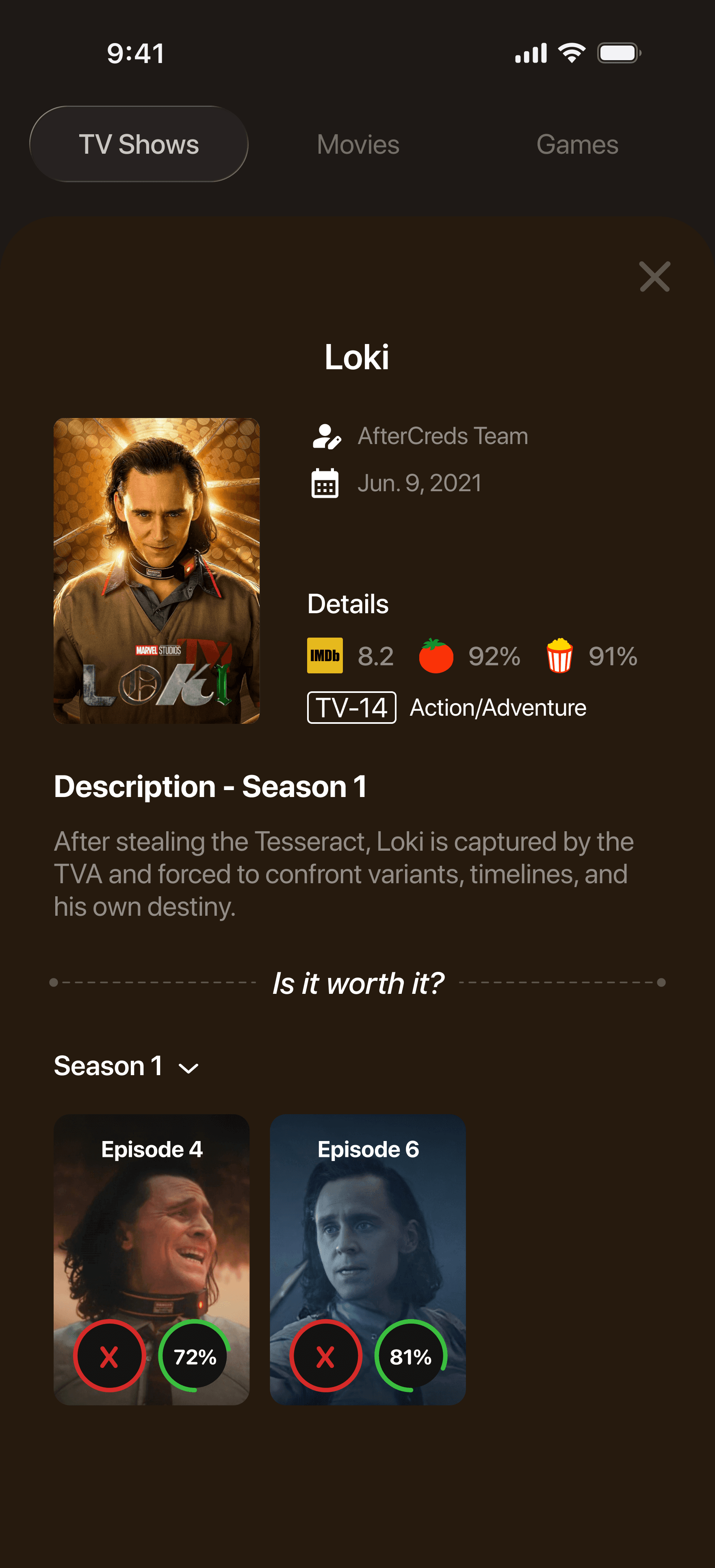
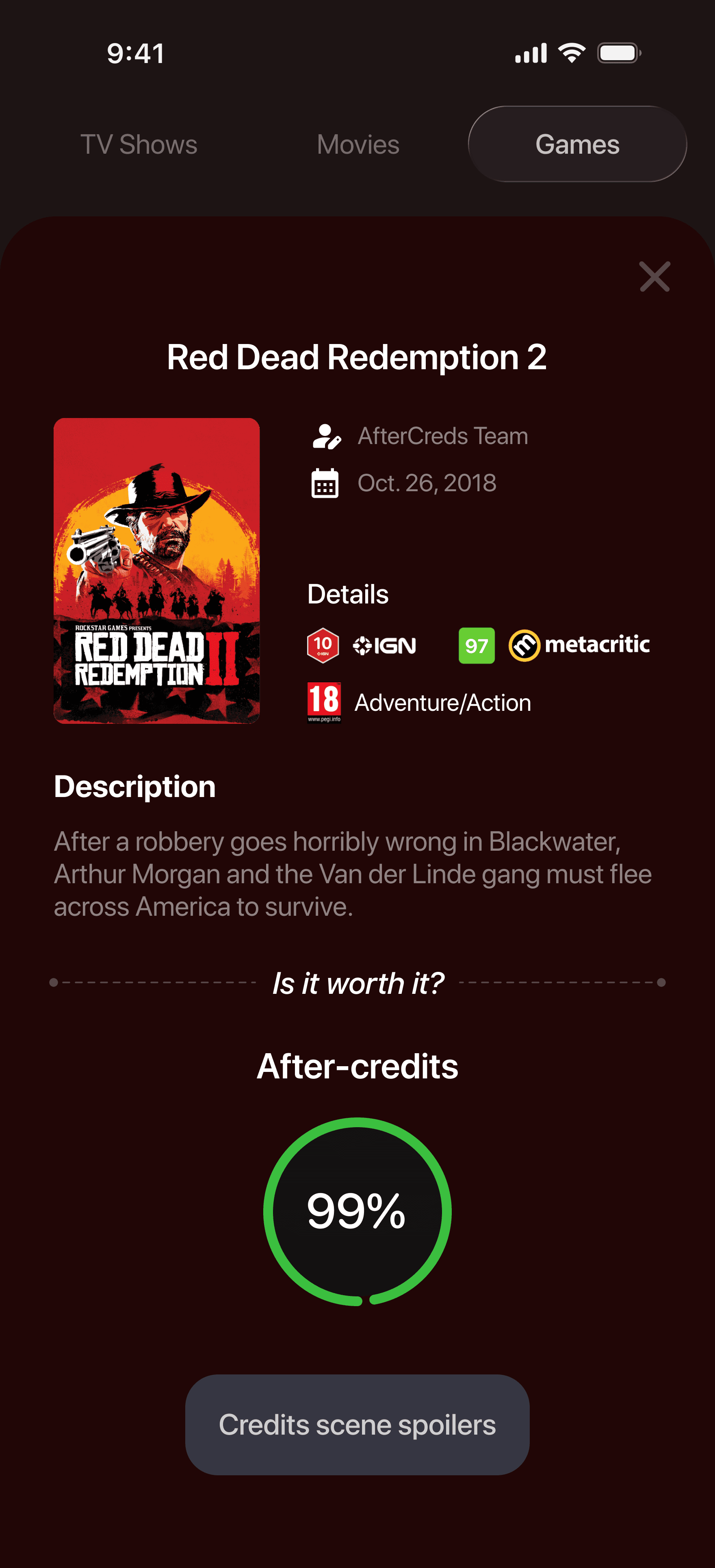
CreditCookies: Know Before the Credits Roll
The core features include real-time percentages and spoiler-tagged summaries across movies, TV shows and games.
Making Undo Feel Safe
Deciding on the undo button wording was a fun challenge. I needed language that let users remove their vote without making the interaction feel like they had made a mistake.
•
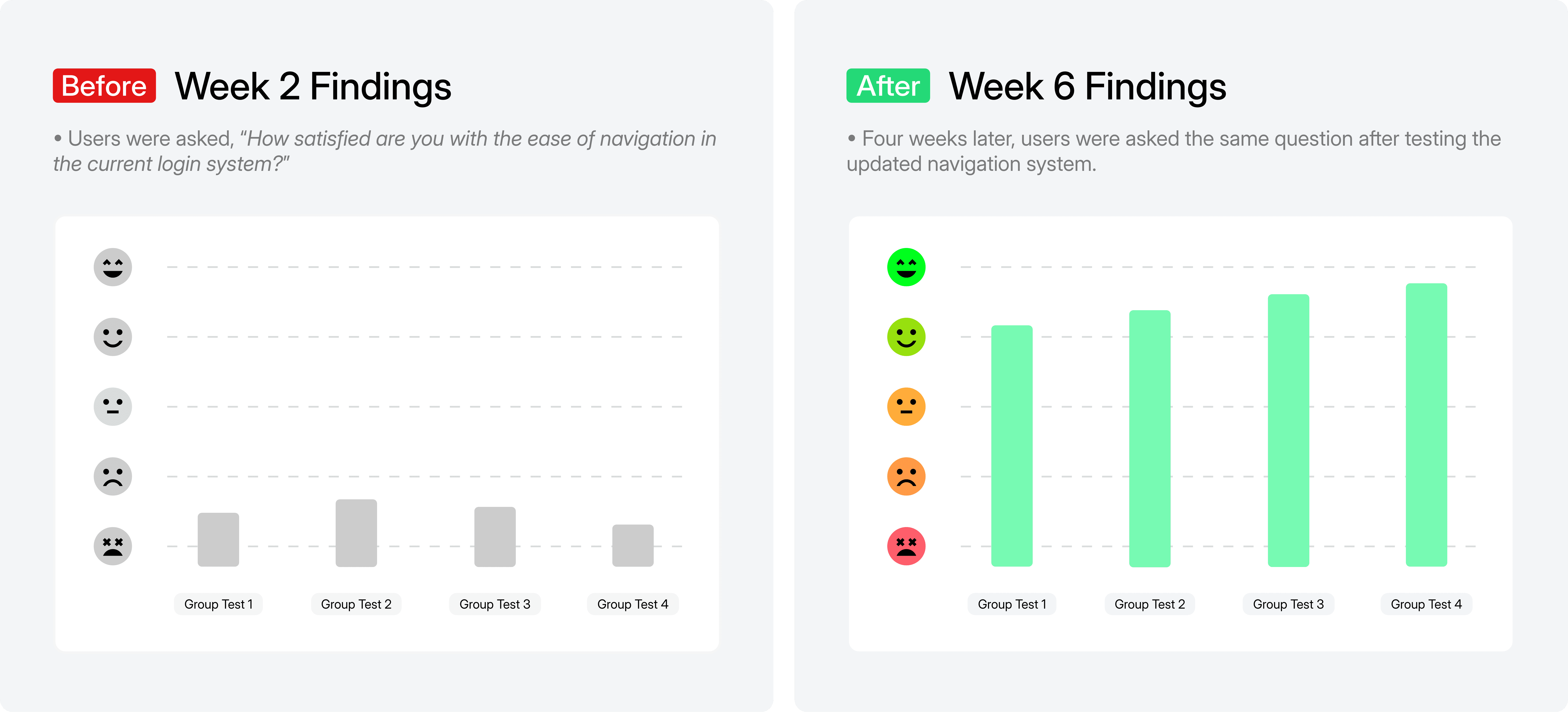
RELEASE
/
VERSION COMPARISON
•
DEMO
/
PROGRAM NAVIGATION
RESULTS
Measuring the Impact
•
METRICS
/
IMPACT METRICS


REFLECTION
Reflecting with Gratitude and Celebrating Our 5-Year Renewal
The redesign strengthened the partnership and resulted in a five year contract renewal
Great things! Our wonderful team received the good news that Stellantis renewed their five-year contract!
Honestly, I’m grateful for the journey and the small but incredible Stellantis team. From frontend, backend, project manager and QA, everyone made this process truly memorable!