


Dark Mode
/
Volkswagen & Audi
Delivered enterprise UX redesign for Stellantis’ incentive platform, raising productivity 30%, task completion 27%, and enabling a five year strategic renewal.
Delivered enterprise UX redesign for Stellantis’ incentive platform, raising productivity 30%, task completion 27%, and enabling a five year strategic renewal.
ROLE
Lead Product Designer
TIMELINE
2022 - 2024
2022 - 2024
DELIVERABLE
Desktop analytics dashboard
TOOLS
Adobe XD
Adobe XD
INTRO
Project Overview
During my two years at Stellantis, I have successfully led 12 major feature releases, redesigned the system from the ground up and improved workflows while collaborating closely with project managers and developers to ensure smooth platform operations.
Our team’s role was to support Stellantis’ corporate and dealer users in managing performance, tracking sales, handling incentives, and overseeing role-based access.
For this presentation, I’ll walk through the Login & Navigation flows, I’ll share user feedback, highlight key pain points and explain how I guided the team to resolve these challenges through design decisions.
PROBLEMS
Login Flow & Navigation Struggles
Users lost productivity and trust due to login and navigation issues
For one release, Stellantis users were losing time and trust in the platform due to slow login steps, repetitive data entry and confusing navigation that made even simple tasks feel harder than they should have.
Repetitive login friction frustrated users
Through our post-release process, the most important (and honestly, the most fun) part was gathering user feedback. Many users were frustrated by repetitive issues that added up over time. During the release of our Login & Navigation flow, their feedback gave us clear voices to learn from.
I broke everything down and concluded the following:


•
FEEDBACK
/
USER PAIN POINTS
Login challenges steadily reduced confidence in the system
Users felt like they had to work around the platform just to complete basic tasks, and over time, that chipped away at their confidence in the system. This became a major breaking point, which led to ongoing frustration and a noticeable decline in trust toward the platform’s reliability.

•
OVERVIEW
/
USER TESTING TIMELINE
GATHERING DATA
Analyzing Feedback & Issues
Led focused workshops to uncover the root usability problems
I led several sessions focused on uncovering pain points, including user interviews, internal team discussions and stakeholder feedback meetings. I also reviewed recorded meetings, ran A/B tests, analyzed vision tracking data and dug through team notes alongside developers to validate the ongoing issues and patterns.
QA transcripts revealed consistent and recurring pain patterns
Most of the data came from our QA department, which manages customer support calls and tickets. We transcribed these calls using OtterPilot AI, then imported the transcripts into Dovetail, where they were organized into key pain points.
QA transcripts revealed consistent and recurring pain patterns
Most of the data came from our QA department, which manages customer support calls and tickets. We transcribed these calls using OtterPilot AI, then imported the transcripts into Dovetail, where they were organized into key pain points.
After reviewing these frustrations, I grouped them by shared themes:

•
CHALLENGE
/
PAIN POINTS
/
LOGIN FLOW & NAVIGATION
LOGIN UPDATE
Providing Key Fixes for Login System
We simplified login so users could get in without the hassle
For our first iteration feedback, we decided to focus on simplifying the login process. The first release was viable but it lacked speed for returning users.
We simplified login so users could get in without the hassle
For our first iteration feedback, we decided to focus on simplifying the login process. The first release was viable but it lacked speed for returning users.
Our two primary targeted areas for this iteration are improving how quickly users can access the system and reducing as much friction during login actions as possible.
•
RELEASE
/
VERSION COMPARISON
Returning users could access the platform in seconds
Lets users create a keyID for quicker access next time by providing email for recovery options.


•
DEMO
/
SAVED LOGIN SESSION
Returning users could access the platform in seconds
Lets users create a keyID for quicker access next time by providing email for recovery options.
•
DEMO
/
SAVED LOGIN SESSION
Removed unnecessary steps to make login feel effortless
Loads the last saved session using a passcode keyID created during users first save login setup, implemented a recovery method as well.
•
DEMO
/
RETURNING USERS
•
FLOW
/
RECOVER keyID
•
FLOW
/
INVALID EMAIL
•
FLOW
/
INVALID keyID
Removed unnecessary steps to make login feel effortless
Loads the last saved session using a passcode keyID created during users first save login setup, implemented a recovery method as well.
•
DEMO
/
RETURNING USERS
•
FLOW
/
RECOVER keyID
•
FLOW
/
INVALID EMAIL
•
FLOW
/
INVALID keyID
NAVIGATION UPDATE
Easy Program Navigation & Smarter Dropdown
Navigation was redesigned to make program access faster and more intuitive across the platform
During this stage of research, we implemented changes that helped tremendously with navigation issues:
Navigation was redesigned to make program access faster and more intuitive across the platform
During this stage of research, we implemented changes that helped tremendously with navigation issues:
We removed unnecessary steps to make login feel effortless
Programs now include a hover dropdown that appears on all pages globally, allowing users to quickly navigate and cycle through different domains without going back to the home page.
We removed unnecessary steps to make login feel effortless
Programs now include a hover dropdown that appears on all pages globally, allowing users to quickly navigate and cycle through different domains without going back to the home page.
•
DEMO
/
PROGRAM NAVIGATION
Repetitive login friction frustrated users
Let users select a default program during their initial login. This reduces time spent manually changing the program later for each user.
•
DEMO
/
PROGRAM SELECTION
Repetitive login friction frustrated users
Let users select a default program during their initial login. This reduces time spent manually changing the program later for each user.
•
DEMO
/
PROGRAM SELECTION
Navigation was redesigned to make program access seamless across the platform
Users can now type to search and select programs/options instantly, this reduces friction and saves time across all regions. This feature is now applied globally.
•
DEMO
/
DROPDOWN UPDATE
Navigation was redesigned to make program access seamless across the platform
Users can now type to search and select programs/options instantly, this reduces friction and saves time across all regions. This feature is now applied globally.
•
DEMO
/
DROPDOWN UPDATE
RESULTS
Measuring the Impact
KPIs were validated through an eight week structured testing cycle
The KPI metrics were measured through an 8-week testing cycle combining qualitative surveys and quantitative benchmarks across four dealership user groups, during this time we were able to see drastic improvements within productivity, navigation speed, task completion and user satisfaction.
•
METRICS
/
IMPACT METRICS
• We found steady improvement across user confidence, task completion speed and ease of use.
• With strong projection above 70% on Week 4, all areas exceeded 80% by Week 6, confirming stronger usability and overall satisfaction.
• We found steady improvement across user confidence, task completion speed and ease of use.
• With strong projection above 70% on Week 4, all areas exceeded 80% by Week 6, confirming stronger usability and overall satisfaction.
Login time dropped by nearly ninety percent after the redesign
This was a major step up, we reduced a large significant of repetitive logins. Returning users no longer had to re-enter their UID and scroll through dropdowns with the help of keyID and Returning User login. This eliminates average login time by nearly 90%.
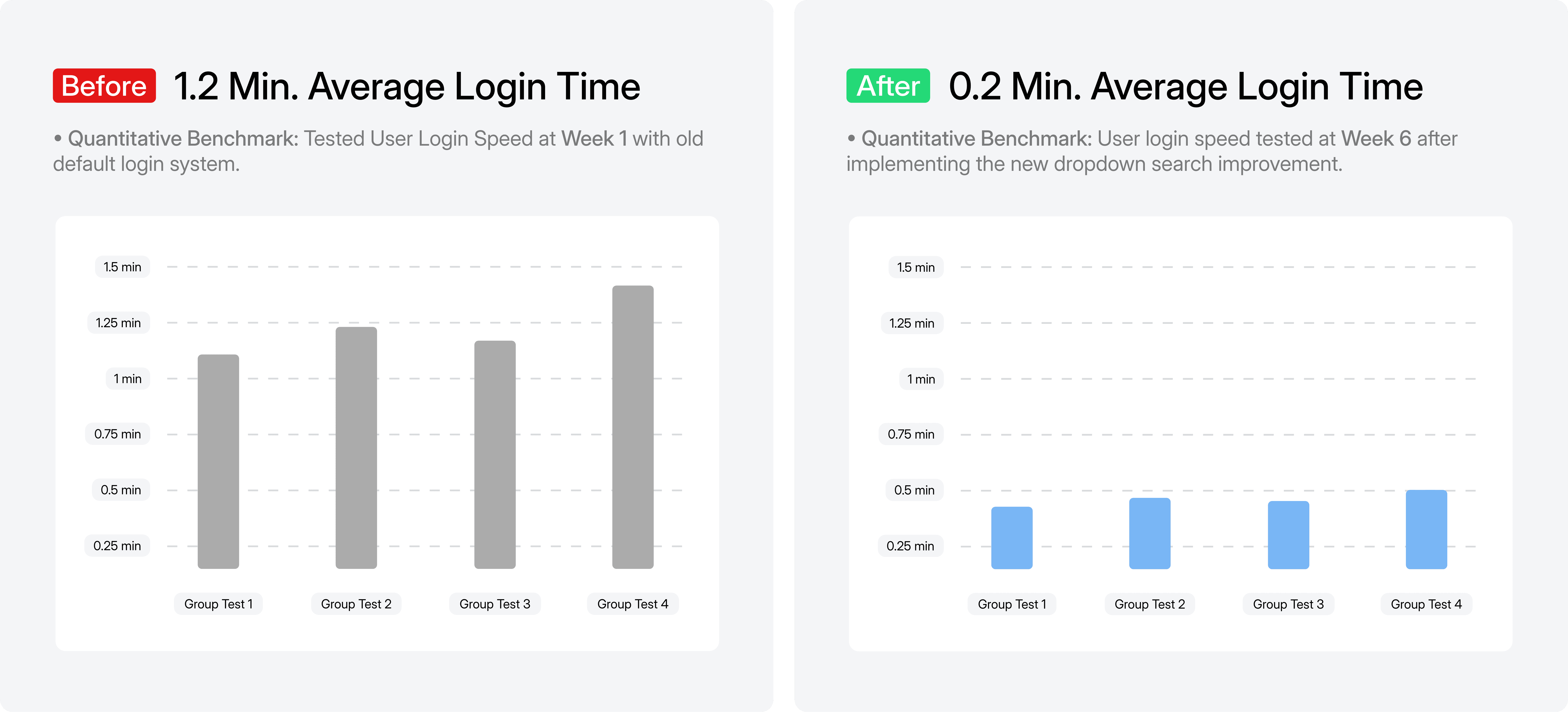
• From Week 1 to Week 6, we found that the average login time decreased from 1.2 minutes to 0.2 minutes after introducing the new system.
• Our findings suggest that the update made login tasks 90% faster and significantly improved overall task efficiency.

• We found that most users understood how to create and save their keyID easily.
• Over 90% said the login process was clear and quick to complete, however, findings suggest that users felt like recovering keyID should be a bit smoother.
Login time dropped by nearly ninety percent after the redesign
This was a major step up, we reduced a large significant of repetitive logins. Returning users no longer had to re-enter their UID and scroll through dropdowns with the help of keyID and Returning User login. This eliminates average login time by nearly 90%.
• From Week 1 to Week 6, we found that the average login time decreased from 1.2 minutes to 0.2 minutes after introducing the new system.
• Our findings suggest that the update made login tasks 90% faster and significantly improved overall task efficiency.
• We found that most users understood how to create and save their keyID easily.
• Over 90% said the login process was clear and quick to complete, however, findings suggest that users felt like recovering keyID should be a bit smoother.
Navigation updates shifted from frustration to confidence
By introducing smarter dropdown inputs, enabling program switching across all pages, and allowing users to select a default program upon login, we saw an increase in customer satisfaction. Users could switch programs without losing progress and complete their tasks much more easily.
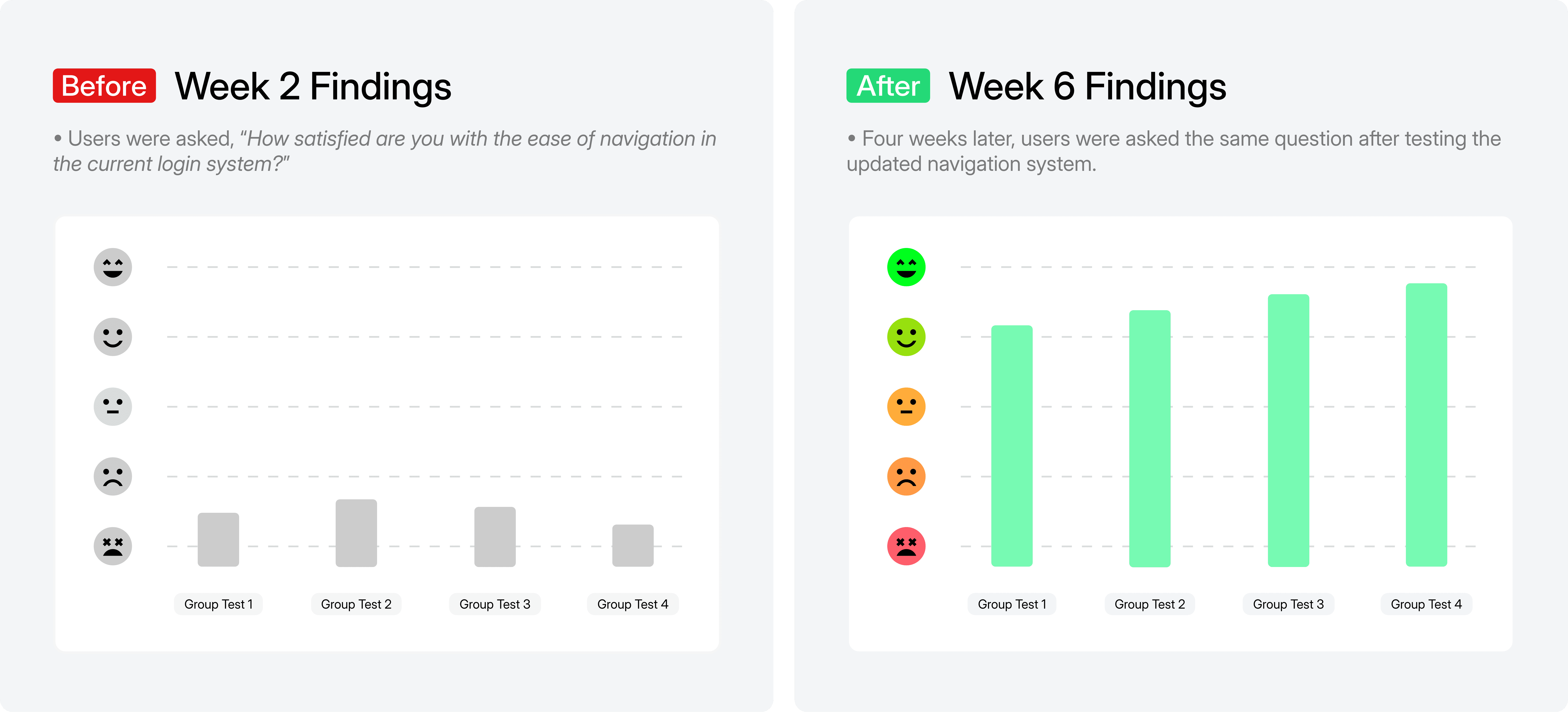
• User satisfaction increased between Week 2 and Week 6, shifting from mostly negative to highly positive.
• Our findings suggest that the new navigation experience (type-to-search dropdown, switch program dropdown and selecting default program for login) helped users login and move through the platform with less effort.

• In Week 8, all four user groups responded positively to the new type-to-search dropdown and default program options.
• Most participants reported that navigation felt faster and more convenient, particularly appreciating the improved dropdown and the ease of switching programs.
• Our survey results indicate the need for continued follow-up testing to evaluate the effectiveness of the default program selection.
Navigation updates shifted from frustration to confidence
By introducing smarter dropdown inputs, enabling program switching across all pages, and allowing users to select a default program upon login, we saw an increase in customer satisfaction. Users could switch programs without losing progress and complete their tasks much more easily.
• User satisfaction increased between Week 2 and Week 6, shifting from mostly negative to highly positive.
• Our findings suggest that the new navigation experience (type-to-search dropdown, switch program dropdown and selecting default program for login) helped users login and move through the platform with less effort.
• In Week 8, all four user groups responded positively to the new type-to-search dropdown and default program options.
• Most participants reported that navigation felt faster and more convenient, particularly appreciating the improved dropdown and the ease of switching programs.
• Our survey results indicate the need for continued follow-up testing to evaluate the effectiveness of the default program selection.
REFLECTION
Reflecting with Gratitude and Celebrating Our 5-Year Renewal
The platform evolved from an incomplete system into a scalable enterprise solution
There were many aspects that weren't highlighted here but this is generally how the process works. We begin with a client meeting, followed by a debrief, which is then divided into sprints. We allocate team resources, engage in ideation, design, gather developer feedback, conduct testing, and finally, hand off to the client.
This project began with an incomplete design file and grew into a scalable, intuitive platform for corporate and dealer users. Over two years, I learned endless of leadership opportunities and value of collaboration, from iteration to handoffs and how tiny small design choices can drive major impact.
The redesign strengthened the partnership and resulted in a five year contract renewal
Great things! Our wonderful team received the good news that Stellantis renewed their five-year contract!
Honestly, I’m grateful for the journey and the small but incredible Stellantis team. From frontend, backend, project manager and QA, everyone made this process truly memorable!